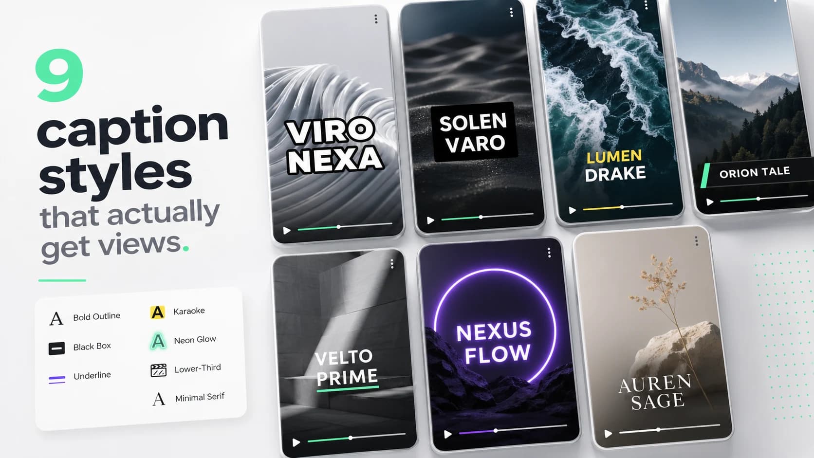
We pulled 200 of the most-watched short-form clips of the last quarter — TikTok, Reels and YouTube Shorts, all with at least 1M views — and counted caption treatments. Roughly 80% of viral video uses one of nine styles. The other 20% is novelty (handwritten effects, animated characters) and almost none of it repeats.
What follows is every style ranked by how often it appears, with the actual font weight, stroke width and color values you need to recreate it. Copy any of these and you'll already be inside the visual grammar viewers expect.
1. Bold outline (MrBeast)
Heavy black stroke around white fill, ALL CAPS, font weight 800–900, paint-order stroke first. The Mr. Beast school. Roughly 28% of viral clips. Works on every background because the stroke gives you contrast for free.
- Font: Anton, Inter Black, Bebas Neue, or any condensed display sans.
- Stroke: 3–6px black, paint-order: stroke fill.
- Fill: pure white.
- Tracking: -0.02em (slightly tight).
2. Box background
White text on a rounded black plate at 78% opacity. The cleanest, most legible style for talking-head content. ~17% of clips. Reads great in low light and on busy backgrounds.
- Font: Inter, SF Pro, Geist — any modern sans at semibold.
- Background: rgba(0,0,0,0.78), 12–16px corner radius.
- Padding: 12px horizontal, 8px vertical.
- Avoid: hard black (1.0 opacity) — it cuts the image too aggressively.
3. Karaoke highlight
The single active word turns a brand color (usually green or yellow) while the rest stays white. ~14% of clips. The strongest tool for forcing viewers to read along, which is why podcast clippers love it.
Karaoke only works with word-level timing. If your tool only gives you sentence-level timestamps, this style will look broken.
Your karaoke color is your strongest brand signal in short-form. Mr. Beast uses red. Alex Hormozi uses yellow. SoCaptions uses #34eba4 mint. Pick one and lock it.
4. Cinematic
Lighter weight, wide letter-spacing, soft drop shadow, lower-third positioned. ~9% of clips. The default for moody music videos, fashion content and high-production B-roll.
- Font: medium weight, uppercase, letter-spacing 0.18em.
- Shadow: 0 2px 8px rgba(0,0,0,0.7).
- Position: bottom 18–22% of frame, never centered.
5. Highlight underline
Yellow swipe behind the keyword — like a highlighter through paper. ~6% of clips. Big in productivity / business content; reads as 'this is the part to remember'.
6. Word-by-word reveal
Single word at a time, no scroll, no overflow. ~6% of clips. Highest reading completion of any style — viewers literally cannot scroll while a new word is appearing — but it caps your dialogue density. If your speaker talks fast, this style will feel choppy.
7. Platform native (TikTok / Reels)
The platform's default sans-serif, generated by the upload flow. ~5% of clips with this as their primary style. Functional, never memorable. Useful as a fallback, never as a brand.
8. Neon glow
Saturated text with a soft purple, pink or teal blur halo. ~3% of clips. Almost entirely confined to gaming, music drops and aesthetic edits. Don't use it on talking-head content — it reads as visual noise.
9. Minimal serif
Small, restrained, often centered. ~2% of clips. Found mostly in interview cuts, food content and editorial pieces. The hardest style to do well because there's no stroke or background hiding bad font choices.
What's quietly disappearing
Two treatments dropped sharply between 2024 and 2026: animated shake/wiggle effects (viewers report fatigue, click-throughs dropped) and double-line stacked captions (too dense for vertical viewing on phones). If your default still uses either, switching to bold outline or box will lift average watch time within a week of changing.
How to actually pick one
There are only three questions that matter. Answer them and the choice is usually obvious:
- 01What's the dominant content type? Talking-head → bold outline or box. B-roll-heavy → cinematic or highlight. Music / vibe → neon or minimal serif.
- 02Will viewers watch on bright phone screens outdoors? If yes, you need a stroke or background — that rules out cinematic and minimal serif.
- 03Are you trying to look like a category (fitness, finance, food) or stand out from it? Bold outline blends in everywhere; karaoke and highlight are louder choices.
Pick one style per channel and stay there for at least 30 days. Mixing styles reads as inconsistency, not range. The strongest creator brands have been using the same caption style for 2–3 years straight.
The cheat sheet
If you only remember three things from this article: bold outline is the safest default, karaoke is the strongest engagement tool, and your style decision matters more than your color decision. Most creators rebrand colors twice a year and never touch their captions — that's backwards.