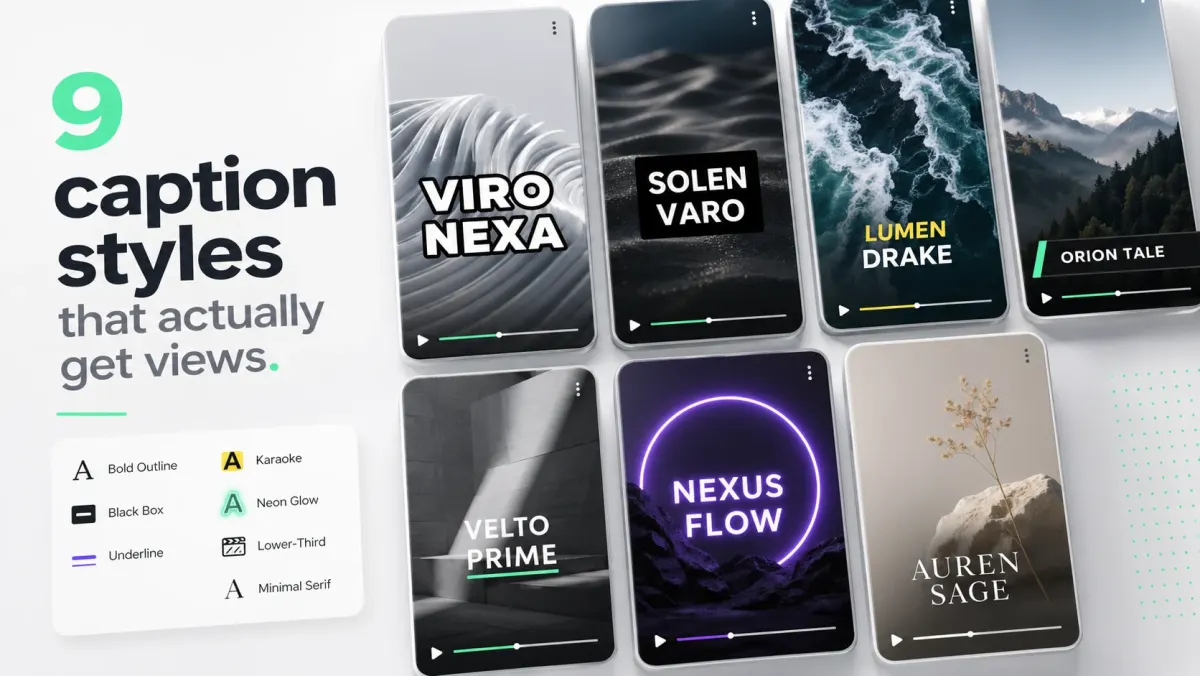
Looking for the best font for subtitles? Choose a face that stays readable at small sizes, clear over moving backgrounds, and strong enough to carry a stroke or shadow. For most creators, the safest choices are Inter, Montserrat, Poppins, Roboto, Arial, Helvetica, SF Pro, Geist, and similar geometric or neo-grotesk sans-serif fonts. For louder short-form captions, Anton, Bebas Neue, Bangers, and Impact-style display fonts can work, but only when the lines are short and the stroke is clean.
Font choice is less about taste than tolerance. A subtitle font has to survive compression, phone brightness, motion blur, fast cuts, and inconsistent backgrounds. Fonts that look beautiful in a static design can fail as captions because their thin strokes, decorative shapes, or narrow counters disappear once the video is viewed inside a social feed.
The best subtitle fonts by use case
| Font family | Best for | Why it works | Watch-out |
|---|---|---|---|
| Inter / Roboto | Tutorials and dense subtitles | Open letterforms and dependable punctuation | Can feel plain without a strong style treatment |
| Montserrat / Poppins | Branded social captions | Geometric shapes with enough weight for a stroke | Wide words can force extra line breaks |
| Anton / Bebas Neue | Short hooks and punchlines | Condensed, bold silhouettes that survive mobile video | Uncomfortable for long sentences or all-day reading |
| Bangers / display fonts | Comedy, gaming, and reaction clips | Distinctive personality for short phrases | Novelty shapes lose legibility when cues get long |
15 subtitle fonts worth testing
- Inter — the safest all-purpose default for tutorials, explainers, and social captions.
- Roboto — familiar, compact, and dependable when captions need to fit more words.
- Montserrat — a branded geometric sans that stays strong with a stroke.
- Poppins — rounded and friendly for creator content, products, and lifestyle clips.
- Arial — a plain broadcast-style fallback with reliable punctuation and numerals.
- Helvetica — a restrained choice for documentary, editorial, and cinematic subtitles.
- Open Sans — highly legible for courses, webinars, and longer sentences.
- Noto Sans — a practical multilingual option when scripts or accents vary.
- SF Pro — clean on Apple-heavy workflows and dense educational captions.
- Geist — a modern neutral sans for product demos and software tutorials.
- Anton — a heavy condensed face for short hooks and keyword emphasis.
- Bebas Neue — an all-caps display option for punchlines, not paragraphs.
- Bangers — playful comic energy for gaming, reactions, and short phrases.
- Impact — a high-contrast meme-style option that needs careful line length.
- Lato — a warm, readable alternative for interviews, courses, and brand videos.
- Best all-purpose: Inter, Geist, SF Pro, Roboto, Helvetica.
- Best creator captions: Montserrat, Poppins, Avenir-style geometric sans.
- Best bold viral style: Anton, Bebas Neue, Bangers, Impact-like condensed fonts.
- Best tutorials: Inter Semibold, Roboto Medium, Montserrat Semibold.
- Best cinematic captions: a clean medium sans or restrained serif used sparingly.
What makes a subtitle font good
A good subtitle font has clear letterforms, generous counters, simple punctuation, strong numerals, and predictable weight. Viewers should be able to distinguish I, l, 1, O, and 0 quickly. They should also be able to read the font when a stroke is added. Some decorative fonts collapse when outlined because the shapes were never designed to carry a thick border.
Weight matters more than family. A medium or semibold cut of a clean font often beats a trendy font at regular weight. For social captions, start around 600-800 weight. For all-caps styles, use 800-900. For cinematic captions, you can go lighter, but only if the background is dark or the shadow is strong.
Bangers, Montserrat, and other common choices
Bangers is a loud comic-style font. It can work for challenge videos, reaction clips, gaming, kids content, and intentionally playful captions. It is not a good default for serious education, B2B clips, or documentary-style content. If you use Bangers, keep captions short, use a strong stroke, and avoid long mixed-case sentences.
Montserrat is a stronger general-purpose choice. It has enough personality for social video but remains readable in tutorials, explainers, and product content. Montserrat Semibold with a black stroke is a dependable caption style. Montserrat ExtraBold works well for short hooks and keyword emphasis.
Anton and Bebas Neue are condensed display fonts. They create a strong viral look, especially in all caps, but they are less comfortable for long captions. Use them for hooks, punchlines, and short phrases. Use a more neutral sans for dense educational subtitles.
Fonts to avoid for subtitles
- Thin scripts and handwriting fonts: hard to read quickly and often fail with strokes.
- High-contrast fashion serifs: elegant in posters, fragile in compressed video.
- Ultra-condensed fonts for long sentences: they save width but reduce scanning speed.
- Novelty fonts used for every line: personality turns into fatigue.
- Fonts with poor punctuation and numerals: bad for tutorials, prices, dates, and timestamps.
How to style the font
A subtitle font is only half the system. Pair it with the right treatment. White fill plus black stroke is the safest all-purpose style. White text on a semi-transparent black box is the cleanest tutorial style. Yellow or mint active-word highlights work well for karaoke captions. A soft drop shadow can work for cinematic edits, but it is weaker than a stroke on bright backgrounds.
For a new channel, use Montserrat or Inter at semibold/bold weight with white fill, 2-4px black stroke, and short two-line captions. It is simple, readable, and hard to break.
How SoCaptions handles font decisions
SoCaptions presets are designed around font behavior, not just appearance. Bold Outline uses heavy shapes because the stroke needs room. Box works with cleaner sans fonts because the background plate handles contrast. Karaoke relies on consistent word widths so the active highlight feels stable. That is why preset selection usually matters more than manually trying ten fonts.
The best workflow is to choose the caption style first, then adjust font only if the content demands it. If your clip is fast, use a heavier font. If your clip is calm, use a cleaner font. If the video has lots of numbers or technical terms, prioritize clarity over personality.
FAQ
What is the best font for subtitles?
Inter, Montserrat, and Poppins are the most reliable subtitle fonts for social video — heavy enough to carry a stroke, clear at small sizes, and legible over moving backgrounds. For high-energy short-form hooks, Anton and Bebas Neue in all caps create the viral look common on TikTok and Reels. Avoid thin-stroked decorative fonts — they collapse under video compression.
What font do most TikTok captions use?
The most common fonts in TikTok captions are Montserrat Black, Anton, and Bebas Neue — all heavy, condensed, and designed to pop over fast-cut footage. Word-by-word karaoke captions typically use a bold sans-serif with a thick black stroke or a solid color background plate behind the active word.
Should subtitle fonts be bold?
Yes — semibold or bold is the minimum for subtitle legibility. Thin and regular weights disappear over video backgrounds, especially after platform compression. Stroke thickness scales with font weight: a bold font can carry a 4–6px stroke cleanly; a regular-weight font cannot.
What fonts should I avoid for subtitles?
Avoid serif fonts (Georgia, Times, Playfair), thin or light-weight sans-serifs, handwriting fonts, and any decorative font with elaborate stroke details. These fail under video compression, especially on mobile screens where subtitle text is already small. Stick to geometric or neo-grotesk sans-serifs at bold or black weight.