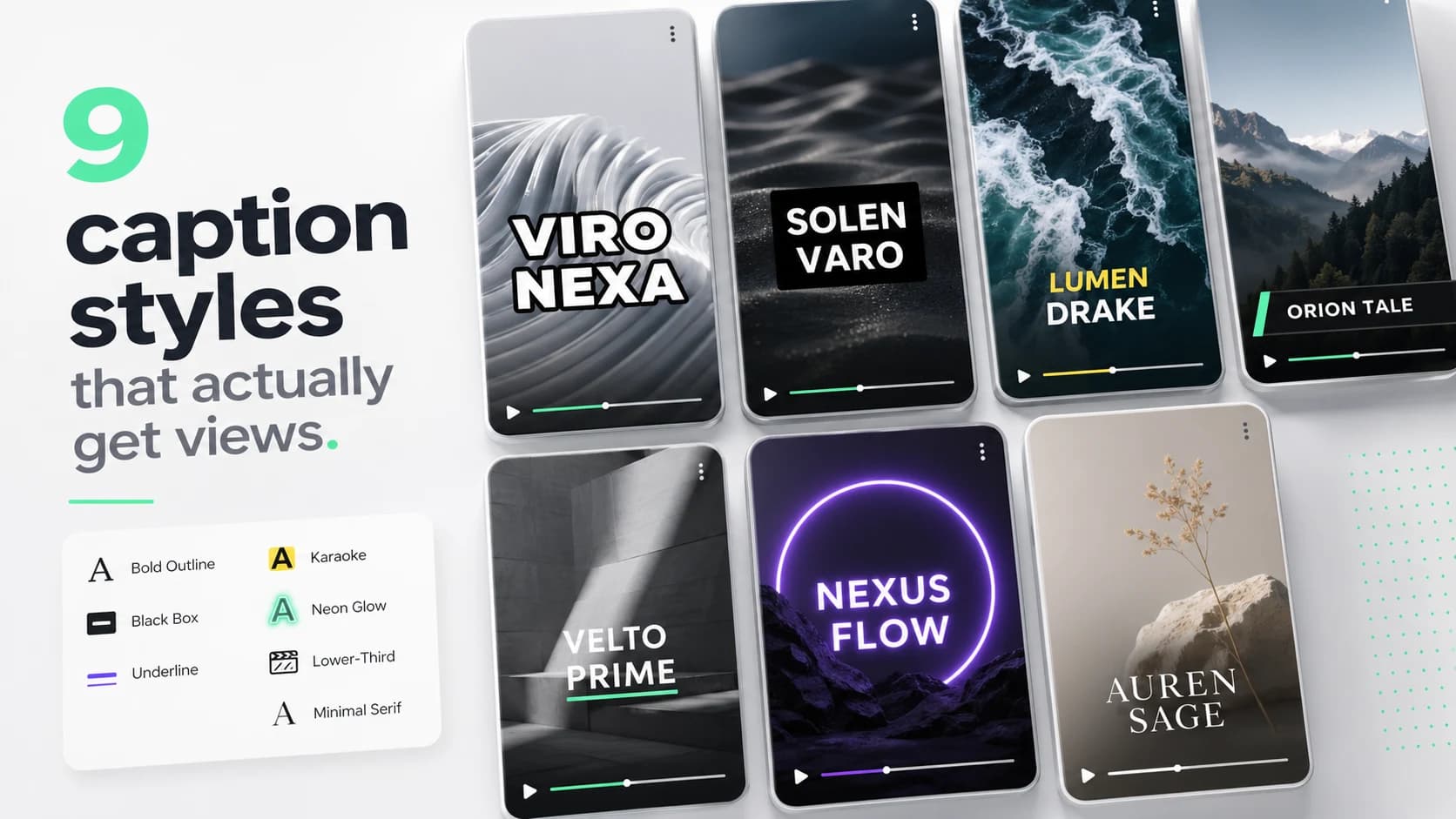
Most creators design captions once and post them everywhere. That is fine for the first 10,000 followers. Past that, the per-platform optimization starts to matter — different platforms eat different parts of the frame, attract different reading speeds, and respond to different visual energy.
Here is the quick-reference spec table, followed by the reasoning behind each number.
- TikTok: 70–90px font, 60–80px stroke weight, 22–28 CPS, keep captions above y:1360px (150px above bottom UI), bold + karaoke highlight.
- Instagram Reels: 60–80px font, 18–22 CPS, keep captions above y:1350px (bottom 420–600px is risky), bold outline or box.
- YouTube Shorts: 60–75px font, 18–22 CPS, more usable frame — bottom 180px is the only hard block, medium-bold sans.
- LinkedIn: 56–68px font, 15–18 CPS, bottom 10% blocked by UI, clean box or shadow — no karaoke.
- X / Twitter: 60–80px font, 18–22 CPS, light UI so burned-in captions always win, heavier stroke to survive compression.
- Facebook: 60–75px font, 18–22 CPS, bottom 10% and top 10% are risky, bold sans with strong contrast.
TikTok
TikTok rewards retention in the first three seconds more than any other platform. That makes captions essential — not decorative. The viewer is deciding whether to swipe while reading the hook, so the caption must be fast, bold, and placed well above the bottom UI.
- Caption energy: high. Bold weights, karaoke highlights, fast scale-in animations.
- Safe zone: avoid the top 250px (status bar, search) and bottom 460px (username, like/comment/share, audio label, CTA). Right side 180px is the action column.
- Recommended caption position: y:700–1360px on 1080×1920 — upper portion of that band for talking heads, lower portion for tutorials.
- Font size: 70–90px. Anything smaller collapses on small-screen phones and under TikTok's video compression.
- Reading speed: 22–28 CPS — TikTok viewers read fast and the algorithm rewards completion, so push the pace.
- Default style: bold white sans (Anton, Montserrat Black, or Inter Black), 4–6px black stroke, mint or yellow karaoke highlight.
- Avoid: wide captions that reach into the right action column. Keep max line width to ~80% of frame width.
Instagram Reels
Reels audiences skew slightly older than TikTok and tolerate cleaner aesthetics. The safe zone is nearly identical to TikTok in the vertical dimension, but Instagram's right-side action column is narrower.
- Caption energy: high but slightly cleaner than TikTok. Fewer rapid animations.
- Safe zone: avoid bottom 420px organic / 520–600px for Reels ads. Top 250px is covered by the UI. Right side ~160px.
- Recommended caption position: y:700–1350px. For ads, move captions higher into the y:700–1100px band to stay clear of the expanded ad CTA.
- Font size: 60–80px on 1080×1920.
- Reading speed: 18–22 CPS.
- Default style: bold sans, white with 4–5px black stroke, optional brand color karaoke highlight.
- Cross-post note: if you design for TikTok safe zones, you will be safe on Reels — TikTok's bottom UI is slightly more aggressive.
YouTube Shorts
Shorts viewers come from YouTube's longer-form ecosystem, which means they tolerate slightly denser text and a calmer visual style. The platform UI is also lighter at the bottom, giving you more frame to work with.
- Caption energy: medium. Clean, readable sans-serifs outperform high-energy karaoke on Shorts.
- Safe zone: bottom 180px blocked by subscribe button and progress bar. Top 8% for the header.
- Recommended caption position: y:600–1550px — significantly more usable area than TikTok or Reels.
- Font size: 60–75px on 1080×1920.
- Reading speed: 18–22 CPS. Shorts viewers read more carefully than TikTok scrollers.
- Default style: medium-bold sans (Inter SemiBold, Roboto Medium), white with 3–4px stroke or plate. Line lengths can be up to 50 chars vs. TikTok's 35–40.
- Avoid: karaoke on instructional Shorts — it can feel frantic when the tone is educational.
LinkedIn is a professional audience with a slow scroll. The energy is lower, the text can be denser, and karaoke highlights read as too casual for most B2B content. The bottom 10% is covered by engagement buttons.
- Caption energy: low. Clean, editorial-feeling captions outperform loud animation.
- Safe zone: bottom 10% (bottom 192px on 1080×1920) is covered. Top 8%.
- Recommended caption position: lower third, y:900–1540px. Slightly higher than TikTok because the frame has more room at the bottom.
- Font size: 56–68px on 1080×1920. Slightly smaller than TikTok — the viewer is usually on a desktop or giving more focused attention.
- Reading speed: 15–18 CPS — viewers are reading deliberately, not scrolling past.
- Default style: clean sans, medium weight (Inter Medium or SemiBold), white with subtle shadow or dark box. Never karaoke.
- Avoid: bright highlight colors, rapid animations, and all-caps shouting. LinkedIn B2B audiences penalize the visual tone of social-video energy.
X / Twitter
X autoplay videos on mute in the feed. There is no reliable closed-caption upload path for most creators, so burned-in captions are non-negotiable. X also compresses video harder than most platforms, which means strokes need to be thicker than you expect.
- Caption energy: low to medium.
- Safe zone: lighter UI than TikTok or Reels — the player controls are minimal during autoplay. Keep captions away from the bottom 100px and top 60px.
- Recommended caption position: y:600–1560px on 1080×1920.
- Font size: 60–80px. Go thicker because X re-encodes video at lower bitrates than YouTube or TikTok.
- Reading speed: 18–22 CPS.
- Default style: bold sans, white with 5–6px black stroke. Heavier strokes survive X's compression better than thinner ones.
- Avoid: thin fonts, light strokes, or pastel text colors — they break under X's re-encode.
- Caption energy: medium.
- Safe zone: bottom 10%, top 10%. Facebook's feed can also crop the sides, so avoid placing key text in the outer 5% horizontally.
- Recommended position: y:700–1400px on 1080×1920.
- Font size: 60–75px.
- Reading speed: 18–22 CPS.
- Default style: bold sans with strong contrast — Facebook's mixed-format feed compresses harder than Reels and renders captions in worse contexts (sidebar, suggested video panels).
Cross-posting workflow
- 01Build for TikTok safe zones first — it has the strictest overlay. If your captions are readable on TikTok, they survive Reels and Shorts without change.
- 02Keep captions above y:1360px (on a 1080×1920 canvas) as a universal floor.
- 03Use Inter Black, Montserrat Black, or Anton at 70px+ for any platform with heavy compression (TikTok, X, Facebook).
- 04Drop to Inter SemiBold at 60–68px for LinkedIn and Shorts where the audience reads more carefully.
- 05Use one default style for 80% of content. Reserve a second style for hero clips only.
- 06Test on a real phone before publishing any video you plan to promote. Editor previews lie.
Brand consistency on short-form lives in caption style. Pick one font, one stroke, one highlight color, and use it for at least 30 days before changing anything. Viewers recognize your style before they recognize your face.
FAQ
What size should captions be on social media?
For 1080×1920 vertical video: 70–90px on TikTok, 60–80px on Reels, 60–75px on Shorts and LinkedIn. For 1920×1080 horizontal video: 48–60px. The rule of thumb: captions should be readable at arm's length on a phone without zooming in. If you need to squint, increase size or weight — most creators err too small, not too large.
Where should captions be placed on social video?
On TikTok: keep captions between y:700px and y:1360px on a 1080×1920 canvas. On Reels: avoid the bottom 420px (organic) or 600px (ads). On Shorts: bottom 180px is the only hard block. On LinkedIn: avoid the bottom 192px. The universal safe position: center the caption block around the 55–65% mark from the top — it clears every platform's bottom UI and most top overlays.
Should captions be the same style on every platform?
No. TikTok and Reels respond to bold, high-energy karaoke. LinkedIn needs clean box-style captions. Shorts work best with readable sans-serifs at moderate energy. Build for TikTok safe zones first (strictest) and you are safe cross-posting, but tune the energy level per platform — the same karaoke style that crushes on TikTok reads as noise on LinkedIn.
What reading speed should social media captions use?
TikTok and Reels: 22–28 CPS (the audience is fast and the algorithm rewards completion). YouTube Shorts and X: 18–22 CPS. LinkedIn: 15–18 CPS. Netflix caps at 17 CPS for adult English content — a good reference for professional B2B video. YouTube auto-captions have no cap and often produce unreadable bursts above 30 CPS.
What font is best for social media captions?
Bold or black weight sans-serif fonts dominate social captioning because they read under compression and on small screens. The most-used options: Inter Black, Montserrat Black, Anton, Bebas Neue, and Oswald Bold. For LinkedIn and professional content, drop to Inter SemiBold or Roboto Medium — they read as premium without feeling aggressive. Avoid thin, script, or decorative fonts for captions; they collapse under platform re-encoding.
How do you make captions readable on a busy background?
Three options, in order of reliability: (1) Add a 4–6px black stroke around the text — this gives every letter a light and dark boundary regardless of background. (2) Add a semi-transparent black plate behind the caption block. (3) Use a drop shadow with 60–80% opacity and a 4–8px blur radius. Test your caption on the worst frame — the brightest or most chaotic background in the clip. If it reads there, it reads everywhere.
Production workflow
The practical way to apply this guide is to treat social media subtitle best practices for 2026: tiktok, reels, shorts, linkedin & x as a repeatable production workflow, not a one-off fix. Start with the final video file, not the rough edit. Make the content understandable first, make the captions accurate second, and make the styling attractive third. That order prevents the most common mistake in video caption work: spending time on color, animation, or font choice before the words, timing, and placement are correct.
For short-form video, the workflow should be fast enough that you can use it every time you publish. If the process takes 45 minutes per clip, you will skip it when you are busy. A good caption workflow should fit inside the final polish pass: upload the final cut, generate captions, fix the transcript, choose the preset, check safe zones, preview on mute, and export. That is enough for most creator, founder, marketer, and agency clips.
- 01Watch the video once without captions and write the single idea the viewer must understand.
- 02Generate or paste the transcript and remove anything that distracts from that idea.
- 03Set caption timing before styling. Timing problems are more damaging than font problems.
- 04Choose one readable visual system: outline, box, karaoke, cinematic, or minimal.
- 05Check the worst frame in the video, not the cleanest frame.
- 06Preview the export at phone size with sound off.
- 07Publish only when the message is clear without audio.
Quality checklist before publishing
Use this checklist before publishing any video related to social media subtitle best practices. It is intentionally practical. The goal is not to create a perfect studio deliverable; the goal is to avoid the errors that cause people to swipe, misunderstand the message, or miss the call to action.
- The first caption appears early enough to support the hook.
- No caption is hidden by platform buttons, username text, captions, CTA buttons, or progress controls.
- Every important proper noun, number, price, URL, and product name is spelled correctly.
- Lines break around phrases instead of splitting random words.
- The caption block uses enough contrast on the brightest frame.
- The style matches the content category: louder for fast social, cleaner for tutorials, calmer for B2B.
- The video still makes sense with sound off.
- The export was checked after rendering, not only inside the editor preview.
- The caption position is consistent with other videos on the same channel.
- The final CTA is visible, readable, and not competing with native platform UI.
Common mistakes to avoid
The biggest mistake is treating captions as decoration. Captions are part of the content layer. They carry meaning, pace, emphasis, accessibility, and retention. If they are late, too small, hidden, or hard to read, the viewer does not experience them as a design flaw; they experience the whole video as harder to watch.
The second mistake is designing for the editor canvas instead of the feed. Editors show a clean preview. Social platforms add buttons, labels, captions, comments, compression, and device variation. Always assume the published version will be harsher than the preview. More margin, stronger contrast, and shorter lines are usually better than a layout that looks elegant only in the editor.
- Do not put the most important text at the very bottom of vertical video.
- Do not use thin fonts for fast speech or small mobile viewing.
- Do not rely on color alone for emphasis if contrast is weak.
- Do not generate captions before the edit is final unless you expect to redo timing.
- Do not export once and assume every platform will display the file the same way.
How to use SoCaptions for this
SoCaptions is built for the practical version of this workflow: quick caption generation, editable transcript cleanup, readable presets, and export-ready MP4 captions for social video. Use it when the edit is mostly done and the remaining job is to make the words visible, timed, and polished. That is where a focused caption tool is faster than opening a full video editor and rebuilding a caption system from scratch.
The best SoCaptions workflow is simple. Upload the final video, generate captions, fix the transcript, pick a preset, adjust placement for the platform, preview the full clip, and export. For high-volume creators, save a consistent style and reuse it. Consistency matters because viewers learn where to read your captions and begin to recognize your videos before they consciously notice the branding.
Try the workflow on a real 20-40 second clip before changing your whole process. One finished export will tell you whether the caption style, placement, and timing are strong enough for your channel.
FAQ
What is the fastest way to handle social media subtitle best practices?
The fastest reliable method is to work from the final video, use an automatic caption or transcript tool, fix only the meaningful mistakes, and apply a proven preset instead of designing from zero. Manual control is useful, but manual setup is expensive if you repeat it for every clip. Use automation for the repetitive timing work and spend your attention on clarity, placement, and final review.
Should I use burned-in captions or a caption file?
Use burned-in captions when you need every viewer to see the text immediately in a social feed. Use a caption file such as SRT or VTT when accessibility, toggling, translation, or platform-native playback matters. For important videos, the strongest workflow is often both: a captioned social export for reach and a clean transcript or caption file for accessibility and reuse.
How do I know if the captions are readable enough?
Preview the video on a phone-sized screen with sound off. If you can understand the point without leaning in, pausing, or replaying, the captions are probably readable. Then check the brightest frame, the busiest frame, and the final export after compression. Readability is proven in the worst viewing condition, not the best screenshot.
How much should I customize the style?
Customize enough to fit your brand, but not so much that the captions become harder to read. Most channels need one dependable default and one alternate style for special clips. Constantly changing fonts, colors, and animation makes the content feel less consistent and slows production. A simple repeatable style usually beats a new design for every post.
What should I measure after publishing?
Measure retention, average watch time, completion rate, rewatches, comments that mention clarity, and whether viewers understand the call to action. View count alone is too noisy. If caption improvements work, you should see fewer early drop-offs and better comprehension on clips where the spoken message matters.