LinkedIn video captions are the single biggest lever for engagement on the platform in 2026. LinkedIn autoplays every video on mute, and the average user scrolls past in under 2 seconds. If your first frame doesn't have readable text, you've lost the impression. This guide covers everything: how to add captions to LinkedIn video, what format to use, burned-in vs SRT, sizing, styling, and the exact workflow that gets results.
Burn captions in SoCaptions (/editor), export MP4, upload to LinkedIn. Platform-specific tips: /captions-for/linkedin. Compare burned-in vs SRT: /blog/burned-in-captions-vs-closed-captions.
Why LinkedIn video needs captions
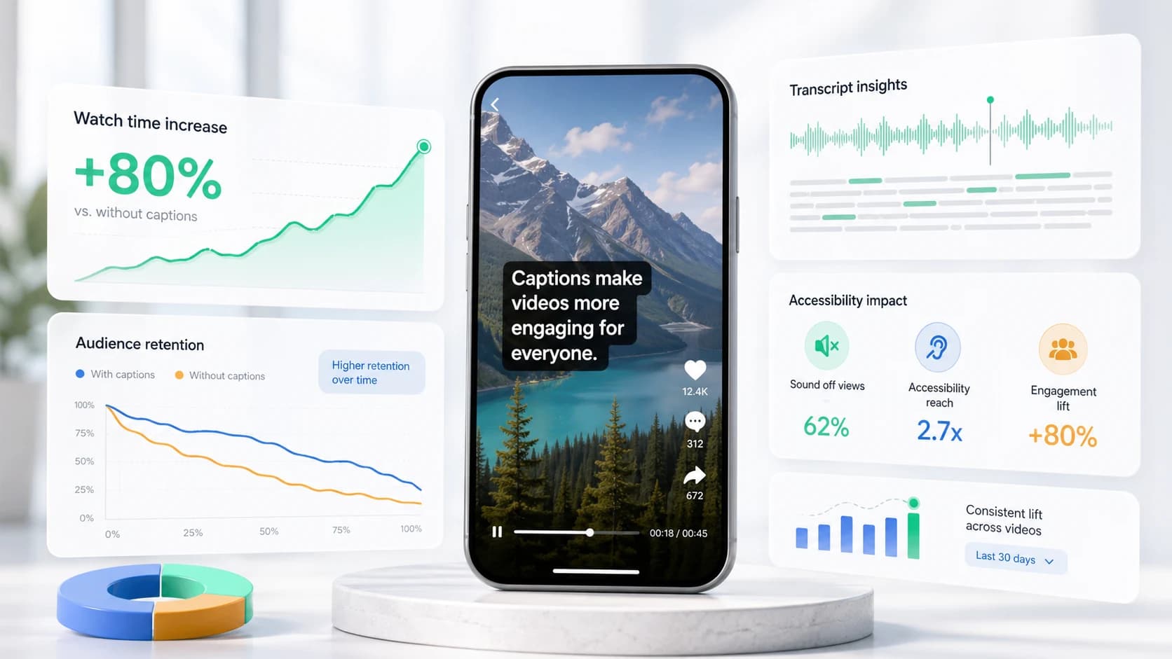
LinkedIn's feed is consumed primarily during work hours — in offices, on commutes, in meetings. Sound is almost never on. Internal LinkedIn data shows that captioned video gets 1.4× the engagement of uncaptioned video. The platform's algorithm also uses caption text for topic matching, which means captioned video surfaces in more relevant feeds.
- 80%+ of LinkedIn video is watched on mute.
- Captioned LinkedIn posts get 1.4× more engagement on average.
- LinkedIn indexes SRT text for search and topic matching.
- The algorithm favors videos with higher dwell time — captions directly increase dwell.
How to add captions to LinkedIn video
There are two methods, and the best workflow uses both. First, burn captions directly into the MP4 file so they're visible the instant the video autoplays. Second, upload an SRT file through LinkedIn's caption upload flow for accessibility and search indexing.
Method 1: Burn captions into the video
- 01Upload your final video to SoCaptions.
- 02Generate captions (Whisper transcribes in 10–30 seconds).
- 03Pick a style — Box or Bold Outline work best on LinkedIn's mixed-device feed.
- 04Export the MP4 with captions burned in.
- 05Upload the captioned MP4 to LinkedIn.
Method 2: Upload an SRT file
- 01In the LinkedIn post composer, upload your video.
- 02Click the pencil/edit icon on the video preview.
- 03Select 'Add captions' and upload your .srt file.
- 04LinkedIn will display toggleable closed captions in the player.
LinkedIn video caption sizes and safe zones
LinkedIn's feed renders video in three places: mobile vertical autoplay (1080×1920), desktop in-feed (1920×1080 cropped to ~16:9 in the feed), and the full lightbox view. Caption design has to work in the worst of those — usually mobile, where text appears smaller than the design preview suggests.
- Use a font size that's at least 5–6% of frame height (≈55px on 1080-tall video).
- Keep the caption block centered horizontally and vertically — LinkedIn doesn't crop the same way TikTok does.
- Avoid the bottom 12% of frame on vertical video — the like / comment chrome covers it.
- High-contrast text wins. White on solid background is more readable than fancy karaoke colors at LinkedIn scroll speed.
- For horizontal (16:9) video, use 48–60px font on a 1920×1080 canvas.
Best caption styles for LinkedIn
LinkedIn's audience skews professional. The styles that work on TikTok (neon, karaoke highlight, word-by-word reveal) can feel out of place. The two styles that consistently perform on LinkedIn are Box (white text on a semi-transparent dark plate) and Bold Outline (white text with a thick black stroke). Both survive LinkedIn's aggressive video compression and read well on both phone and desktop.
- Box style: clean, professional, high readability on any background.
- Bold Outline: slightly more energetic, works for thought-leadership clips.
- Avoid: neon glow, animated shake, or overly casual styles.
- Font choice: Inter, Geist, or any modern sans-serif at semibold or bold weight.
SRT vs burned captions on LinkedIn
LinkedIn's closed captions (SRT upload) are accessibility-grade but invisible by default — viewers must click the CC button. Burned captions are visible the instant the video autoplays. The right answer is both: burn the visual captions for retention and reach, attach an SRT for accessibility compliance and LinkedIn's search index.
LinkedIn video format and specs
MP4 with H.264 video and AAC audio. Caption file should be SRT — LinkedIn doesn't accept VTT through the publish flow as of early 2026. Maximum video length is 10 minutes for most accounts. Recommended resolution: 1080×1920 for vertical, 1920×1080 for horizontal.
- Format: MP4 (H.264 + AAC)
- Caption file: SRT only
- Max length: 10 minutes
- Vertical: 1080×1920 (9:16)
- Horizontal: 1920×1080 (16:9)
- Frame rate: 30 fps
- Bitrate: 8–15 Mbps for clean compression
Common mistakes with LinkedIn video captions
- Using only SRT upload without burned-in captions — most viewers never toggle CC on.
- Font too small — LinkedIn's desktop feed renders video smaller than you'd expect.
- Captions placed in the bottom 12% — covered by LinkedIn's engagement buttons.
- Using TikTok-style karaoke on a B2B audience — reads as unprofessional.
- Forgetting that LinkedIn compresses video heavily — thin fonts disappear.
FAQ
Does LinkedIn auto-generate captions?
LinkedIn has a built-in auto-captions feature for organic video posts, but it's inconsistent and can't be styled. For reliable, branded captions that appear immediately in the feed without the viewer clicking CC, burn captions into the MP4 before uploading.
What caption file format does LinkedIn accept?
LinkedIn accepts SRT files through the web composer. Upload your video, click the pencil icon on the video preview, then select 'Add captions' and upload the .srt file. LinkedIn does not accept VTT as of early 2026.
Do LinkedIn captions help with reach?
Yes — LinkedIn's algorithm indexes SRT caption text for topic matching, which means captioned video surfaces in more relevant feeds. Burned-in captions boost dwell time (because muted viewers keep watching), which the algorithm also treats as a positive engagement signal.
What font size should LinkedIn captions be?
Use at least 5–6% of frame height — roughly 55px on a 1080-tall vertical video. LinkedIn renders video smaller in the desktop feed than the preview suggests, so err larger. Bold weight with a stroke or background plate survives the platform's heavy video compression.
Production workflow
The practical way to apply this guide is to treat linkedin video captions: srt upload + burned-in workflow (2026) as a repeatable production workflow, not a one-off fix. Start with the final video file, not the rough edit. Make the content understandable first, make the captions accurate second, and make the styling attractive third. That order prevents the most common mistake in video caption work: spending time on color, animation, or font choice before the words, timing, and placement are correct.
For short-form video, the workflow should be fast enough that you can use it every time you publish. If the process takes 45 minutes per clip, you will skip it when you are busy. A good caption workflow should fit inside the final polish pass: upload the final cut, generate captions, fix the transcript, choose the preset, check safe zones, preview on mute, and export. That is enough for most creator, founder, marketer, and agency clips.
- 01Watch the video once without captions and write the single idea the viewer must understand.
- 02Generate or paste the transcript and remove anything that distracts from that idea.
- 03Set caption timing before styling. Timing problems are more damaging than font problems.
- 04Choose one readable visual system: outline, box, karaoke, cinematic, or minimal.
- 05Check the worst frame in the video, not the cleanest frame.
- 06Preview the export at phone size with sound off.
- 07Publish only when the message is clear without audio.
Quality checklist before publishing
Use this checklist before publishing any video related to linkedin video captions. It is intentionally practical. The goal is not to create a perfect studio deliverable; the goal is to avoid the errors that cause people to swipe, misunderstand the message, or miss the call to action.
- The first caption appears early enough to support the hook.
- No caption is hidden by platform buttons, username text, captions, CTA buttons, or progress controls.
- Every important proper noun, number, price, URL, and product name is spelled correctly.
- Lines break around phrases instead of splitting random words.
- The caption block uses enough contrast on the brightest frame.
- The style matches the content category: louder for fast social, cleaner for tutorials, calmer for B2B.
- The video still makes sense with sound off.
- The export was checked after rendering, not only inside the editor preview.
- The caption position is consistent with other videos on the same channel.
- The final CTA is visible, readable, and not competing with native platform UI.
Common mistakes to avoid
The biggest mistake is treating captions as decoration. Captions are part of the content layer. They carry meaning, pace, emphasis, accessibility, and retention. If they are late, too small, hidden, or hard to read, the viewer does not experience them as a design flaw; they experience the whole video as harder to watch.
The second mistake is designing for the editor canvas instead of the feed. Editors show a clean preview. Social platforms add buttons, labels, captions, comments, compression, and device variation. Always assume the published version will be harsher than the preview. More margin, stronger contrast, and shorter lines are usually better than a layout that looks elegant only in the editor.
- Do not put the most important text at the very bottom of vertical video.
- Do not use thin fonts for fast speech or small mobile viewing.
- Do not rely on color alone for emphasis if contrast is weak.
- Do not generate captions before the edit is final unless you expect to redo timing.
- Do not export once and assume every platform will display the file the same way.
How to use SoCaptions for this
SoCaptions is built for the practical version of this workflow: quick caption generation, editable transcript cleanup, readable presets, and export-ready MP4 captions for social video. Use it when the edit is mostly done and the remaining job is to make the words visible, timed, and polished. That is where a focused caption tool is faster than opening a full video editor and rebuilding a caption system from scratch.
The best SoCaptions workflow is simple. Upload the final video, generate captions, fix the transcript, pick a preset, adjust placement for the platform, preview the full clip, and export. For high-volume creators, save a consistent style and reuse it. Consistency matters because viewers learn where to read your captions and begin to recognize your videos before they consciously notice the branding.
Try the workflow on a real 20-40 second clip before changing your whole process. One finished export will tell you whether the caption style, placement, and timing are strong enough for your channel.
FAQ
What is the fastest way to handle linkedin video captions?
The fastest reliable method is to work from the final video, use an automatic caption or transcript tool, fix only the meaningful mistakes, and apply a proven preset instead of designing from zero. Manual control is useful, but manual setup is expensive if you repeat it for every clip. Use automation for the repetitive timing work and spend your attention on clarity, placement, and final review.
Should I use burned-in captions or a caption file?
Use burned-in captions when you need every viewer to see the text immediately in a social feed. Use a caption file such as SRT or VTT when accessibility, toggling, translation, or platform-native playback matters. For important videos, the strongest workflow is often both: a captioned social export for reach and a clean transcript or caption file for accessibility and reuse.
How do I know if the captions are readable enough?
Preview the video on a phone-sized screen with sound off. If you can understand the point without leaning in, pausing, or replaying, the captions are probably readable. Then check the brightest frame, the busiest frame, and the final export after compression. Readability is proven in the worst viewing condition, not the best screenshot.
How much should I customize the style?
Customize enough to fit your brand, but not so much that the captions become harder to read. Most channels need one dependable default and one alternate style for special clips. Constantly changing fonts, colors, and animation makes the content feel less consistent and slows production. A simple repeatable style usually beats a new design for every post.
What should I measure after publishing?
Measure retention, average watch time, completion rate, rewatches, comments that mention clarity, and whether viewers understand the call to action. View count alone is too noisy. If caption improvements work, you should see fewer early drop-offs and better comprehension on clips where the spoken message matters.