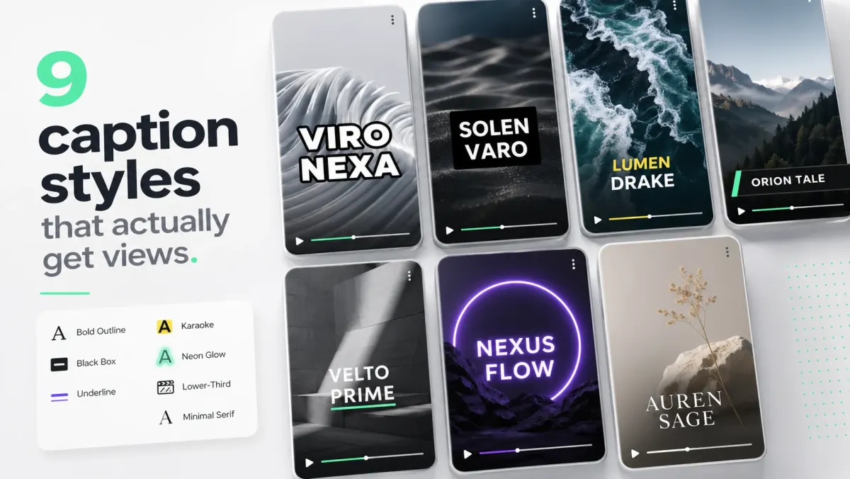
Karaoke captions highlight each word as it is spoken. They are common in short-form video because the moving emphasis gives viewers a clear reading point, especially when audio is muted or difficult to hear. They are a style choice, not a guaranteed performance lift: the hook, pacing, story, and caption accuracy still matter most.
Why karaoke captions can work better than static blocks
Static caption blocks ask the viewer to scan a complete sentence. Karaoke captions provide a moving focal point, which can make short spoken phrases easier to follow at feed speed. The effect is strongest when the words are short, the timing is accurate, and the highlight is easy to distinguish from the base text.
- The active word gives the eye a simple place to look while the sentence is being spoken.
- Word-level timing keeps the text aligned with the audio instead of revealing a full sentence too early.
- Short clusters are easier to scan than a dense paragraph on a phone screen.
- The style feels energetic, but a static block is often better for calm tutorials or dense explanations.
How the style can support a short-form hook
Captions should make the opening line understandable immediately. Use karaoke highlighting when the spoken hook is the main visual message, then check the result on mute at normal feed speed. If the animation competes with the footage or makes the text harder to read, switch to a simpler style.
How to add karaoke captions correctly
- 01Generate a word-level transcript. Most tools default to sentence-level — you need word timestamps.
- 02Pick one highlight color and stay with it. Mint green, hot pink, electric yellow, and bright orange are the most-used. Pick one and use it on every video.
- 03Keep the base text in white with a strong stroke. The highlight should be the only color shift.
- 04Show 2–4 words on screen at a time, never a full sentence. The shorter the cluster, the more the highlight pops.
- 05Match the highlight transition to the syllable, not the word boundary. ~80–120ms transitions feel right.
Mistakes that kill the effect
- Two highlight colors. Picks feel random and break the brand recognition.
- Highlighting punctuation or filler words. Highlight only words that carry meaning.
- Karaoke on long sentences. Past 5–6 words on screen, the highlight loses focus.
- Slow transitions. If the highlight visibly fades, the eye drifts. Make it snap.
- Karaoke on calm content. It works for hooks and energy. It looks wrong on tutorials, B2B, and editorial.
Tooling
SoCaptions ships a Karaoke preset that handles the word-level timing, the color, and the transition automatically. Upload the video, pick Karaoke, choose a highlight color, and export. Word timing comes from Whisper at the transcript step, so the highlight tracks the audio precisely.
Consistency makes a caption style feel intentional. Choose one highlight color that has enough contrast against the base text and keep it consistent across a series.
FAQ
What are karaoke captions?
Karaoke captions are a subtitle style where each word is highlighted as it is spoken — one word lights up at a time in a distinct color, synchronized word-by-word to the audio. They are also called active-word captions or word-by-word captions and are often used for TikTok, Reels, and Shorts hooks.
Do karaoke captions actually increase views?
Not by themselves. Karaoke styling can improve comprehension and make a spoken hook easier to follow, but views still depend on the idea, opening, pacing, audience, and overall video quality. Compare it with a static style on similar clips if you want a reliable answer for your channel.
What color should karaoke caption highlights be?
Mint green, hot pink, electric yellow, and bright orange are common highlight choices. The specific color matters less than contrast and consistency — pick one that stays readable against the base text and footage.
How do I make karaoke captions?
You need a tool that generates word-level timestamps — sentence-level transcription won't work for karaoke. SoCaptions' Karaoke preset handles this automatically: Whisper transcribes with word-level timing, you pick a highlight color, and the export burns the animated captions into MP4. Keep each cluster to 2–4 words on screen at a time for maximum visual impact.
Production workflow
The practical way to apply this guide is to treat karaoke captions — word-by-word tiktok & reels guide as a repeatable production workflow, not a one-off fix. Start with the final video file, not the rough edit. Make the content understandable first, make the captions accurate second, and make the styling attractive third. That order prevents the most common mistake in video caption work: spending time on color, animation, or font choice before the words, timing, and placement are correct.
For short-form video, the workflow should be fast enough that you can use it every time you publish. If the process takes 45 minutes per clip, you will skip it when you are busy. A good caption workflow should fit inside the final polish pass: upload the final cut, generate captions, fix the transcript, choose the preset, check safe zones, preview on mute, and export. That is enough for most creator, founder, marketer, and agency clips.
- 01Watch the video once without captions and write the single idea the viewer must understand.
- 02Generate or paste the transcript and remove anything that distracts from that idea.
- 03Set caption timing before styling. Timing problems are more damaging than font problems.
- 04Choose one readable visual system: outline, box, karaoke, cinematic, or minimal.
- 05Check the worst frame in the video, not the cleanest frame.
- 06Preview the export at phone size with sound off.
- 07Publish only when the message is clear without audio.
Quality checklist before publishing
Use this checklist before publishing any video related to karaoke captions go viral. It is intentionally practical. The goal is not to create a perfect studio deliverable; the goal is to avoid the errors that cause people to swipe, misunderstand the message, or miss the call to action.
- The first caption appears early enough to support the hook.
- No caption is hidden by platform buttons, username text, captions, CTA buttons, or progress controls.
- Every important proper noun, number, price, URL, and product name is spelled correctly.
- Lines break around phrases instead of splitting random words.
- The caption block uses enough contrast on the brightest frame.
- The style matches the content category: louder for fast social, cleaner for tutorials, calmer for B2B.
- The video still makes sense with sound off.
- The export was checked after rendering, not only inside the editor preview.
- The caption position is consistent with other videos on the same channel.
- The final CTA is visible, readable, and not competing with native platform UI.
Common mistakes to avoid
The biggest mistake is treating captions as decoration. Captions are part of the content layer. They carry meaning, pace, emphasis, accessibility, and retention. If they are late, too small, hidden, or hard to read, the viewer does not experience them as a design flaw; they experience the whole video as harder to watch.
The second mistake is designing for the editor canvas instead of the feed. Editors show a clean preview. Social platforms add buttons, labels, captions, comments, compression, and device variation. Always assume the published version will be harsher than the preview. More margin, stronger contrast, and shorter lines are usually better than a layout that looks elegant only in the editor.
- Do not put the most important text at the very bottom of vertical video.
- Do not use thin fonts for fast speech or small mobile viewing.
- Do not rely on color alone for emphasis if contrast is weak.
- Do not generate captions before the edit is final unless you expect to redo timing.
- Do not export once and assume every platform will display the file the same way.
How to use SoCaptions for this
SoCaptions is built for the practical version of this workflow: quick caption generation, editable transcript cleanup, readable presets, and export-ready MP4 captions for social video. Use it when the edit is mostly done and the remaining job is to make the words visible, timed, and polished. That is where a focused caption tool is faster than opening a full video editor and rebuilding a caption system from scratch.
The best SoCaptions workflow is simple. Upload the final video, generate captions, fix the transcript, pick a preset, adjust placement for the platform, preview the full clip, and export. For high-volume creators, save a consistent style and reuse it. Consistency matters because viewers learn where to read your captions and begin to recognize your videos before they consciously notice the branding.
Try the workflow on a real 20-40 second clip before changing your whole process. One finished export will tell you whether the caption style, placement, and timing are strong enough for your channel.
FAQ
What is the fastest way to handle karaoke captions go viral?
The fastest reliable method is to work from the final video, use an automatic caption or transcript tool, fix only the meaningful mistakes, and apply a proven preset instead of designing from zero. Manual control is useful, but manual setup is expensive if you repeat it for every clip. Use automation for the repetitive timing work and spend your attention on clarity, placement, and final review.
Should I use burned-in captions or a caption file?
Use burned-in captions when you need every viewer to see the text immediately in a social feed. Use a caption file such as SRT or VTT when accessibility, toggling, translation, or platform-native playback matters. For important videos, the strongest workflow is often both: a captioned social export for reach and a clean transcript or caption file for accessibility and reuse.
How do I know if the captions are readable enough?
Preview the video on a phone-sized screen with sound off. If you can understand the point without leaning in, pausing, or replaying, the captions are probably readable. Then check the brightest frame, the busiest frame, and the final export after compression. Readability is proven in the worst viewing condition, not the best screenshot.
How much should I customize the style?
Customize enough to fit your brand, but not so much that the captions become harder to read. Most channels need one dependable default and one alternate style for special clips. Constantly changing fonts, colors, and animation makes the content feel less consistent and slows production. A simple repeatable style usually beats a new design for every post.
What should I measure after publishing?
Measure retention, average watch time, completion rate, rewatches, comments that mention clarity, and whether viewers understand the call to action. View count alone is too noisy. If caption improvements work, you should see fewer early drop-offs and better comprehension on clips where the spoken message matters.
